<h:inputText id="quantity"
             size="4"
             value="#{item.quantity}"
             title="#{bundle.ItemQuantity}">
    <f:validateLongRange minimum="0"/>
    ...
</h:inputText>Adding Components to a Page Using HTML Tag Library Tags
The tags defined by the JavaServer Faces standard HTML tag library represent HTML form components and other basic HTML elements. These components display data or accept data from the user. This data is collected as part of a form and is submitted to the server, usually when the user clicks a button. This section explains how to use each of the component tags shown in Table 10-1.
Table 10-1 The Component Tags
Tag |
Functions |
Rendered As |
Appearance |
|
Represents a column of data in a data component |
A column of data in an HTML table |
A column in a table |
|
Submits a form to the application |
An HTML
|
A button |
|
Links to another page or location on a page |
An HTML
|
A link |
|
Represents a data wrapper |
An HTML |
A table that can be updated dynamically |
|
Represents an input form (inner tags of the form receive the data that will be submitted with the form) |
An HTML |
No appearance |
|
Displays an image |
An HTML |
An image |
|
Allows a user to upload a file |
An HTML
|
A field with a Browse… button |
|
Allows a page author to include a hidden variable in a page |
An HTML |
No appearance |
|
Allows a user to input a string without the actual string appearing in the field |
An HTML |
A field that displays a row of characters instead of the actual string entered |
|
Allows a user to input a string |
An HTML
|
A field |
|
Allows a user to enter a multiline string |
An HTML
|
A multirow field |
|
Displays a localized message |
An HTML |
A text string |
|
Displays localized messages |
A set of HTML |
A text string |
|
Displays a formatted message |
Plain text |
Plain text |
|
Displays a nested component as a label for a specified input field |
An HTML |
Plain text |
|
Links to another page or location on a page without generating an action event |
An HTML |
A link |
|
Displays a line of text |
Plain text |
Plain text |
|
Displays a table |
An HTML |
A table |
|
Groups a set of components under one parent |
A HTML
|
A row in a table |
|
Allows a user to change the value of a Boolean choice |
An HTML |
A check box |
|
Displays a set of check boxes from which the user can select multiple values |
A set of HTML |
A group of check boxes |
|
Allows a user to select multiple items from a set of items all displayed at once |
An HTML |
A box |
|
Allows a user to select multiple items from a set of items |
An HTML |
A menu |
|
Allows a user to select one item from a set of items all displayed at once |
An HTML |
A box |
|
Allows a user to select one item from a set of items |
An HTML |
A menu |
|
Allows a user to select one item from a set of items |
An HTML |
A group of options For a standalone radio button, use the |
The tags correspond to components in the javax.faces.component
package. The components are discussed in more detail in
Chapter 12, "Developing with JavaServer Faces
Technology."
The next section explains the important attributes that are common to most component tags. For each of the components discussed in the following sections, Writing Bean Properties explains how to write a bean property bound to that particular component or its value.
For reference information about the tags and their attributes, see the oJavaServer Faces Facelets Tag Library documentation.
Common Component Tag Attributes
Most of the component tags support the attributes shown in Table 10-2.
Table 10-2 Common Component Tag Attributes
Attribute |
Description |
|
Identifies a bean property and binds the component instance to it. |
|
Uniquely identifies the component. |
|
If set to |
|
Specifies a condition under which the component should be rendered. If the condition is not satisfied, the component is not rendered. |
|
Specifies a Cascading Style Sheet (CSS) style for the tag. |
|
Specifies a CSS class that contains definitions of the styles. |
|
Specifies the value of the component in the form of a value expression. |
All the tag attributes except id can accept expressions, as defined by
the EL, described in Expression Language.
An attribute such as rendered or value can be set on the page and
then modified in the backing bean for the page.
The id Attribute
The id attribute is not usually required for a component tag but is
used when another component or a server-side class must refer to the
component. If you don’t include an id attribute, the JavaServer Faces
implementation automatically generates a component ID. Unlike most other
JavaServer Faces tag attributes, the id attribute takes expressions
using only the evaluation syntax described in
Immediate Evaluation, which uses the ${}
delimiters. For more information on expression syntax, see
Value Expressions.
The immediate Attribute
Input components and command components (those that implement the
ActionSource interface, such as buttons and links) can set the
immediate attribute to true to force events, validations, and
conversions to be processed when request parameter values are applied.
You need to carefully consider how the combination of an input
component’s immediate value and a command component’s immediate
value determines what happens when the command component is activated.
Suppose that you have a page with a button and a field for entering the
quantity of a book in a shopping cart. If the immediate attributes of
both the button and the field are set to true, the new value entered
in the field will be available for any processing associated with the
event that is generated when the button is clicked. The event associated
with the button as well as the events, validation, and conversion
associated with the field are all handled when request parameter values
are applied.
If the button’s immediate attribute is set to true but the field’s
immediate attribute is set to false, the event associated with the
button is processed without updating the field’s local value to the
model layer. The reason is that any events, conversion, and validation
associated with the field occur after request parameter values are
applied.
The bookshowcart.xhtml page of the Duke’s Bookstore case study has
examples of components using the immediate attribute to control which
component’s data is updated when certain buttons are clicked. The
quantity field for each book does not set the immediate attribute,
so the value is false (the default).
The immediate attribute of the Continue Shopping hyperlink is set to
true, while the immediate attribute of the Update Quantities
hyperlink is set to false:
<h:commandLink id="continue"
               action="bookcatalog"
               immediate="true">
    <h:outputText value="#{bundle.ContinueShopping}"/>
</h:commandLink>
...
<h:commandLink id="update"
               action="#{showcart.update}"
               immediate="false">
    <h:outputText value="#{bundle.UpdateQuantities}"/>
</h:commandLink>
If you click the Continue Shopping hyperlink, none of the changes
entered into the quantity input fields will be processed. If you click
the Update Quantities hyperlink, the values in the quantity fields
will be updated in the shopping cart.
The rendered Attribute
A component tag uses a Boolean EL expression along with the rendered
attribute to determine whether the component will be rendered. For
example, the commandLink component in the following section of a page
is not rendered if the cart contains no items:
<h:commandLink id="check"
    ...
    rendered="#{cart.numberOfItems > 0}">
    <h:outputText
        value="#{bundle.CartCheck}"/>
</h:commandLink>
Unlike nearly every other JavaServer Faces tag attribute, the rendered
attribute is restricted to using rvalue expressions. As explained in
Value and Method Expressions, these rvalue
expressions can only read data; they cannot write the data back to the
data source. Therefore, expressions used with rendered attributes can
use the arithmetic operators and literals that rvalue expressions can
use but lvalue expressions cannot use. For example, the expression in
the preceding example uses the > operator.
Note: In this example and others, |
The style and styleClass Attributes
The style and styleClass attributes allow you to specify CSS styles
for the rendered output of your tags. Displaying Error
Messages with the h:message and h:messages Tags describes an example of
using the style attribute to specify styles directly in the attribute.
A component tag can instead refer to a CSS class.
The following example shows the use of a dataTable tag that references
the style class list-background:
<h:dataTable id="items"
             ...
             styleClass="list-background"
             value="#{cart.items}"
             var="book">
The style sheet that defines this class is stylesheet.css, which will
be included in the application. For more information on defining styles,
see the Cascading Style Sheets specifications and drafts at
http://www.w3.org/Style/CSS/.
The value and binding Attributes
A tag representing an output component uses the value and binding
attributes to bind its component’s value or instance, respectively, to a
data object. The value attribute is used more commonly than the
binding attribute, and examples appear throughout this chapter. For
more information on these attributes, see
Creating a Managed Bean,
Writing Properties Bound to Component
Values, and Writing Properties Bound to
Component Instances.
Adding HTML Head and Body Tags
The HTML head (h:head) and body (h:body) tags add HTML page
structure to JavaServer Faces web pages.
-
The
h:headtag represents the head element of an HTML page. -
The
h:bodytag represents the body element of an HTML page.
The following is an example of an XHTML page using the usual head and body markup tags:
<!DOCTYPE html PUBLIC "-//W3C//DTD XHTML 1.0 Transitional//EN"
  "http://www.w3.org/TR/xhtml1/DTD/xhtml1-transitional.dtd">
<html xmlns="http://www.w3.org/1999/xhtml">
    <head>
        <title>Add a title</title>
    </head>
    <body>
        Add Content
    </body>
</html>
The following is an example of an XHTML page using h:head and h:body
tags:
<!DOCTYPE html PUBLIC "-//W3C//DTD XHTML 1.0 Transitional//EN"
  "http://www.w3.org/TR/xhtml1/DTD/xhtml1-transitional.dtd">
<html xmlns="http://www.w3.org/1999/xhtml"
      xmlns:h="http://xmlns.jcp.org/jsf/html">
    <h:head>
        Add a title
    </h:head>
    <h:body>
        Add Content
    </h:body>
</html>
Both of the preceding example code segments render the same HTML elements. The head and body tags are useful mainly for resource relocation. For more information on resource relocation, see Resource Relocation Using h:outputScript and h:outputStylesheet Tags.
Adding a Form Component
An h:form tag represents an input form, which includes child
components that can contain data that is either presented to the user or
submitted with the form.
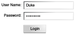
Figure 10-1 shows a typical login form in which a user enters a user name and password, then submits the form by clicking the Login button.
Figure 10-1 A Typical Form
The h:form tag represents the form on the page and encloses all the
components that display or collect data from the user, as shown here:
<h:form>
... other JavaServer Faces tags and other content...
</h:form>
The h:form tag can also include HTML markup to lay out the components
on the page. Note that the h:form tag itself does not perform any
layout; its purpose is to collect data and to declare attributes that
can be used by other components in the form.
A page can include multiple h:form tags, but only the values from the
form submitted by the user will be included in the postback request.
Using Text Components
Text components allow users to view and edit text in web applications. The basic types of text components are as follows:
-
Label, which displays read-only text
-
Field, which allows users to enter text (on one or more lines), often to be submitted as part of a form
-
Password field, which is a type of field that displays a set of characters, such as asterisks, instead of the password text that the user enters
Figure 10-2 shows examples of these text components.
Figure 10-2 Example Text Components
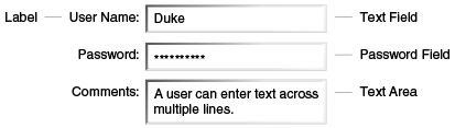
Text components can be categorized as either input or output. A JavaServer Faces output component, such as a label, is rendered as read-only text. A JavaServer Faces input component, such as a field, is rendered as editable text.
The input and output components can each be rendered in various ways to display more specialized text.
Table 10-3 lists the tags that represent the input components.
Table 10-3 Input Tags
Tag |
Function |
|
Allows a page author to include a hidden variable in a page |
|
The standard password field: accepts one line of text with no spaces and displays it as a set of asterisks as it is entered |
|
The standard field: accepts a one-line text string |
|
The standard multiline field: accepts multiple lines of text |
The input tags support the tag attributes shown in Table 10-4 in addition to those described in Common Component Tag Attributes. Note that this table does not include all the attributes supported by the input tags but just those that are used most often. For the complete list of attributes, refer to the oJavaServer Faces Facelets Tag Library documentation.
Table 10-4 Input Tag Attributes
Attribute |
Description |
|
Identifies a converter that will be used to convert the component’s local data. See Using the Standard Converters for more information on how to use this attribute. |
|
Specifies an error message to display when the converter registered on the component fails. |
|
Specifies the direction of the text displayed by this component.
Acceptable values are |
|
Specifies a name that can be used to identify this component in error messages. |
|
Specifies the code for the language used in the rendered
markup, such as |
|
Takes a |
|
Specifies an error message to display when the user does not enter a value into the component. |
|
Identifies a method expression pointing to a managed bean
method that performs validation on the component’s data. See
Referencing a Method That Performs
Validation for an example of using the |
|
Specifies an error message to display when the validator registered on the component fails to validate the component’s local value. |
|
Identifies a method expression that points to a
managed bean method that handles the event of entering a value in this
component. See Referencing a Method That
Handles a Value-Change Event for an example of using
|
Table 10-5 lists the tags that represent the output components.
Table 10-5 Output Tags
Tag |
Function |
|
Displays a formatted message |
|
The standard read-only label: displays a component as a label for a specified input field |
|
Displays an |
|
Displays a one-line text string |
The output tags support the converter tag attribute in addition to
those listed in Common Component Tag Attributes.
The rest of this section explains how to use some of the tags listed in Table 10-3 and Output Tags. The other tags are written in a similar way.
Rendering a Field with the h:inputText Tag
The h:inputText tag is used to display a field. A similar tag, the
h:outputText tag, displays a read-only, single-line string. This
section shows you how to use the h:inputText tag. The h:outputText
tag is written in a similar way.
Here is an example of an h:inputText tag:
<h:inputText id="name"
             label="Customer Name"
             size="30"
             value="#{cashierBean.name}"
             required="true"
             requiredMessage="#{bundle.ReqCustomerName}">
    <f:valueChangeListener
        type="javaeetutorial.dukesbookstore.listeners.NameChanged" />
 </h:inputText>
The label attribute specifies a user-friendly name that will be used
in the substitution parameters of error messages displayed for this
component.
The value attribute refers to the name property of a managed bean
named CashierBean. This property holds the data for the name
component. After the user submits the form, the value of the name
property in CashierBean will be set to the text entered in the field
corresponding to this tag.
The required attribute causes the page to reload, displaying errors,
if the user does not enter a value in the name field. The JavaServer
Faces implementation checks whether the value of the component is null
or is an empty string.
If your component must have a non-null value or a String value at
least one character in length, you should add a required attribute to
your tag and set its value to true. If your tag has a required
attribute that is set to true and the value is null or a zero-length
string, no other validators that are registered on the tag are called.
If your tag does not have a required attribute set to true, other
validators that are registered on the tag are called, but those
validators must handle the possibility of a null or zero-length string.
See Validating Null and Empty Strings
for more information.
Rendering a Password Field with the h:inputSecret Tag
The h:inputSecret tag renders an <input type="password"> HTML tag.
When the user types a string into this field, a row of asterisks is
displayed instead of the text entered by the user. Here is an example:
<h:inputSecret redisplay="false"
               value="#{loginBean.password}" />
In this example, the redisplay attribute is set to false. This will
prevent the password from being displayed in a query string or in the
source file of the resulting HTML page.
Rendering a Label with the h:outputLabel Tag
The h:outputLabel tag is used to attach a label to a specified input
field for the purpose of making it accessible. The following page uses
an h:outputLabel tag to render the label of a check box:
<h:selectBooleanCheckbox id="fanClub"
                         rendered="false"
                         binding="#{cashierBean.specialOffer}" />
<h:outputLabel for="fanClub"
               rendered="false
               binding="#{cashierBean.specialOfferText}">
    <h:outputText id="fanClubLabel"
                  value="#{bundle.DukeFanClub}" />
</h:outputLabel>
...
The h:selectBooleanCheckbox tag and the h:outputLabel tag have
rendered attributes that are set to false on the page but are set to
true in the CashierBean under certain circumstances. The for
attribute of the h:outputLabel tag maps to the id of the input field
to which the label is attached. The h:outputText tag nested inside the
h:outputLabel tag represents the label component. The value
attribute on the h:outputText tag indicates the text that is displayed
next to the input field.
Instead of using an h:outputText tag for the text displayed as a
label, you can simply use the h:outputLabel tag’s value attribute.
The following code snippet shows what the previous code snippet would
look like if it used the value attribute of the h:outputLabel tag to
specify the text of the label:
<h:selectBooleanCheckbox id="fanClub"
                         rendered="false"
                         binding="#{cashierBean.specialOffer}" />
<h:outputLabel for="fanClub"
               rendered="false"
               binding="#{cashierBean.specialOfferText}"
               value="#{bundle.DukeFanClub}" />
</h:outputLabel>
...
Rendering a Link with the h:outputLink Tag
The h:outputLink tag is used to render a link that, when clicked,
loads another page but does not generate an action event. You should use
this tag instead of the h:commandLink tag if you always want the URL
specified by the h:outputLink tag’s value attribute to open and do
not want any processing to be performed when the user clicks the link.
Here is an example:
<h:outputLink value="javadocs">
    Documentation for this demo
</h:outputLink>
The text in the body of the h:outputLink tag identifies the text that
the user clicks to get to the next page.
Displaying a Formatted Message with the h:outputFormat Tag
The h:outputFormat tag allows display of concatenated messages as a
MessageFormat pattern, as described in the API documentation for
java.text.MessageFormat. Here is an example of an h:outputFormat
tag:
<h:outputFormat value="Hello, {0}!">
    <f:param value="#{hello.name}"/>
</h:outputFormat>
The value attribute specifies the MessageFormat pattern. The
f:param tag specifies the substitution parameters for the message. The
value of the parameter replaces the {0} in the sentence. If the value
of "#{hello.name}" is "Bill", the message displayed in the page is as
follows:
Hello, Bill!An h:outputFormat tag can include more than one f:param tag for
those messages that have more than one parameter that must be
concatenated into the message. If you have more than one parameter for
one message, make sure that you put the f:param tags in the proper
order so that the data is inserted in the correct place in the message.
Here is the preceding example modified with an additional parameter:
<h:outputFormat value="Hello, {0}! You are visitor number {1} to the page.">
    <f:param value="#{hello.name}" />
    <f:param value="#{bean.numVisitor}"/>
</h:outputFormat>
The value of {1} is replaced by the second parameter. The parameter is
an EL expression, bean.numVisitor, in which the property numVisitor
of the managed bean bean keeps track of visitors to the page. This is
an example of a value-expression-enabled tag attribute accepting an EL
expression. The message displayed in the page is now as follows:
Hello, Bill! You are visitor number 10 to the page.Using Command Component Tags for Performing Actions and Navigation
In JavaServer Faces applications, the button and link component tags are used to perform actions, such as submitting a form, and for navigating to another page. These tags are called command component tags because they perform an action when activated.
The h:commandButton tag is rendered as a button. The h:commandLink
tag is rendered as a link.
In addition to the tag attributes listed in Common Component
Tag Attributes, the h:commandButton and h:commandLink tags can use
the following attributes.
-
action, which is either a logical outcomeStringor a method expression pointing to a bean method that returns a logical outcomeString. In either case, the logical outcomeStringis used to determine what page to access when the command component tag is activated. -
actionListener, which is a method expression pointing to a bean method that processes an action event fired by the command component tag.
See Referencing a Method That Performs
Navigation for more information on using the action attribute. See
Referencing a Method That Handles an
Action Event for details on using the actionListener attribute.
Rendering a Button with the h:commandButton Tag
If you are using an h:commandButton component tag, the data from the
current page is processed when a user clicks the button, and the next
page is opened. Here is an example of the h:commandButton tag:
<h:commandButton value="Submit"
                 action="#{cashierBean.submit}"/>
Clicking the button will cause the submit method of CashierBean to
be invoked because the action attribute references this method. The
submit method performs some processing and returns a logical outcome.
The value attribute of the example h:commandButton tag references
the button’s label. For information on how to use the action
attribute, see Referencing a Method That
Performs Navigation.
Rendering a Link with the h:commandLink Tag
The h:commandLink tag represents an HTML link and is rendered as an
HTML <a> element.
An h:commandLink tag must include a nested h:outputText tag, which
represents the text that the user clicks to generate the event. Here is
an example:
<h:commandLink id="Duke" action="bookstore">
    <f:actionListener
        type="javaeetutorial.dukesbookstore.listeners.LinkBookChangeListener" />
    <h:outputText value="#{bundle.Book201}"/>
/h:commandLink>
This tag will render HTML that looks something like the following:
<a id="_idt16:Duke" href="#"
     onclick="mojarra.jsfcljs(document.getElementById('j_idt16'),
     {'j_idt16:Duke':'j_idt16:Duke'},'');
return false;">My Early Years: Growing Up on Star7, by Duke</a>Note: The |
Adding Graphics and Images with the h:graphicImage Tag
In a JavaServer Faces application, use the h:graphicImage tag to
render an image on a page:
<h:graphicImage id="mapImage" url="/resources/images/book_all.jpg"/>In this example, the url attribute specifies the path to the image.
The URL of the example tag begins with a slash (/), which adds the
relative context path of the web application to the beginning of the
path to the image.
Alternatively, you can use the facility described in Web Resources to point to the image location. Here are two examples:
<h:graphicImage id="mapImage"
                name="book_all.jpg"
                library="images"
                alt="#{bundle.ChooseBook}"
                usemap="#bookMap" />

<h:graphicImage value="#{resource['images:wave.med.gif']}"/>
You can use similar syntax to refer to an image in a style sheet. The
following syntax in a style sheet specifies that the image is to be
found at resources/img/top-background.jpg:
header {
    position: relative;
    height: 150px;
    background: #fff url(#{resource['img:top-background.jpg']}) repeat-x;
    ...
Laying Out Components with the h:panelGrid and h:panelGroup Tags
In a JavaServer Faces application, you use a panel as a layout container for a set of other components. A panel is rendered as an HTML table. Table 10-6 lists the tags used to create panels.
Table 10-6 Panel Component Tags
Tag |
Attributes |
Function |
|
|
Displays a table |
|
|
Groups a set of components under one parent |
The h:panelGrid tag is used to represent an entire table. The
h:panelGroup tag is used to represent rows in a table. Other tags are
used to represent individual cells in the rows.
The columns attribute defines how to group the data in the table and
therefore is required if you want your table to have more than one
column. The h:panelGrid tag also has a set of optional attributes that
specify CSS classes: columnClasses, footerClass, headerClass,
panelClass, and rowClasses. The role attribute can have the value
"presentation" to indicate that the purpose of the table is to format
the display rather than to show data.
If the headerClass attribute value is specified, the h:panelGrid tag
must have a header as its first child. Similarly, if a footerClass
attribute value is specified, the h:panelGrid tag must have a footer
as its last child.
Here is an example:
<h:panelGrid columns="2"
             headerClass="list-header"
             styleClass="list-background"
             rowClasses="list-row-even, list-row-odd"
             summary="#{bundle.CustomerInfo}"
             title="#{bundle.Checkout}"
             role="presentation">
    <f:facet name="header">
        <h:outputText value="#{bundle.Checkout}"/>
    </f:facet>

    <h:outputLabel for="name" value="#{bundle.Name}" />
    <h:inputText id="name" size="30"
                 value="#{cashierBean.name}"
                 required="true"
                 requiredMessage="#{bundle.ReqCustomerName}">
         <f:valueChangeListener
             type="javaeetutorial.dukesbookstore.listeners.NameChanged" />
    </h:inputText>
    <h:message styleClass="error-message" for="name"/>

    <h:outputLabel for="ccno" value="#{bundle.CCNumber}"/>
    <h:inputText id="ccno"
                 size="19"
                 converterMessage="#{bundle.CreditMessage}"
                 required="true"
                 requiredMessage="#{bundle.ReqCreditCard}">
    <f:converter converterId="ccno"/>
    <f:validateRegex
        pattern="\d{16}|\d{4} \d{4} \d{4} \d{4}|\d{4}-\d{4}-\d{4}-\d{4}" />
    </h:inputText>
    <h:message styleClass="error-message"  for="ccno"/>
    ...
</h:panelGrid>
The preceding h:panelGrid tag is rendered as a table that contains
components in which a customer inputs personal information. This
h:panelGrid tag uses style sheet classes to format the table. The
following code shows the list-header definition:
.list-header {
    background-color: #ffffff;
    color: #000000;
    text-align: center;
}
Because the h:panelGrid tag specifies a headerClass, the
h:panelGrid tag must contain a header. The example h:panelGrid tag
uses an f:facet tag for the header. Facets can have only one child, so
an h:panelGroup tag is needed if you want to group more than one
component within an f:facet. The example h:panelGrid tag has only
one cell of data, so an h:panelGroup tag is not needed. (For more
information about facets, see Using Data-Bound Table
Components.
The h:panelGroup tag has an attribute, layout, in addition to those
listed in Common Component Tag Attributes. If the layout
attribute has the value block, an HTML div element is rendered to
enclose the row; otherwise, an HTML span element is rendered to
enclose the row. If you are specifying styles for the h:panelGroup
tag, you should set the layout attribute to block in order for the
styles to be applied to the components within the h:panelGroup tag.
You should do this because styles, such as those that set width and
height, are not applied to inline elements, which is how content
enclosed by the span element is defined.
An h:panelGroup tag can also be used to encapsulate a nested tree of
components so that the tree of components appears as a single component
to the parent component.
Data, represented by the nested tags, is grouped into rows according to
the value of the columns attribute of the h:panelGrid tag. The
columns attribute in the example is set to 2, and therefore the
table will have two columns. The column in which each component is
displayed is determined by the order in which the component is listed on
the page modulo 2. So, if a component is the fifth one in the list of
components, that component will be in the 5 modulo 2 column, or column
1.
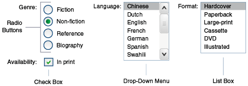
Displaying Components for Selecting One Value
Another commonly used component is one that allows a user to select one value, whether it is the only value available or one of a set of choices. The most common tags for this kind of component are as follows:
-
An
h:selectBooleanCheckboxtag, displayed as a check box, which represents a Boolean state -
An
h:selectOneRadiotag, displayed as a set of options -
An
h:selectOneMenutag, displayed as a scrollable list -
An
h:selectOneListboxtag, displayed as an unscrollable list
Figure 10-3 shows examples of these components.
Figure 10-3 Example Components for Selecting One Item
Displaying a Check Box Using the h:selectBooleanCheckbox Tag
The h:selectBooleanCheckbox tag is the only tag that JavaServer Faces
technology provides for representing a Boolean state.
Here is an example that shows how to use the h:selectBooleanCheckbox
tag:
<h:selectBooleanCheckbox id="fanClub"
                         rendered="false"
                         binding="#{cashierBean.specialOffer}" />
<h:outputLabel for="fanClub"
               rendered="false"
               binding="#{cashierBean.specialOfferText}"
               value="#{bundle.DukeFanClub}" />
The h:selectBooleanCheckbox tag and the h:outputLabel tag have
rendered attributes that are set to false on the page but are set to
true in the CashierBean under certain circumstances. When the
h:selectBooleanCheckbox tag is rendered, it displays a check box to
allow users to indicate whether they want to join the Duke Fan Club.
When the h:outputLabel tag is rendered, it displays the label for the
check box. The label text is represented by the value attribute.
Displaying a Menu Using the h:selectOneMenu Tag
A component that allows the user to select one value from a set of
values can be rendered as a box or a set of options. This section
describes the h:selectOneMenu tag. The h:selectOneRadio and
h:selectOneListbox tags are used in a similar way. The
h:selectOneListbox tag is similar to the h:selectOneMenu tag except
that h:selectOneListbox defines a size attribute that determines how
many of the items are displayed at once.
The h:selectOneMenu tag represents a component that contains a list of
items from which a user can select one item. This menu component is
sometimes known as a drop-down list or a combo box. The following code
snippet shows how the h:selectOneMenu tag is used to allow the user to
select a shipping method:
<h:selectOneMenu id="shippingOption"
                 required="true"
                 value="#{cashierBean.shippingOption}">
    <f:selectItem itemValue="2"
                  itemLabel="#{bundle.QuickShip}"/>
    <f:selectItem itemValue="5"
                  itemLabel="#{bundle.NormalShip}"/>
    <f:selectItem itemValue="7"
                  itemLabel="#{bundle.SaverShip}"/>
 </h:selectOneMenu>
The value attribute of the h:selectOneMenu tag maps to the property
that holds the currently selected item’s value. In this case, the value
is set by the backing bean. You are not required to provide a value for
the currently selected item. If you don’t provide a value, the browser
determines which one is selected.
Like the h:selectOneRadio tag, the h:selectOneMenu tag must contain
either an f:selectItems tag or a set of f:selectItem tags for
representing the items in the list. Using the f:selectItem
and f:selectItems Tags describes these tags.
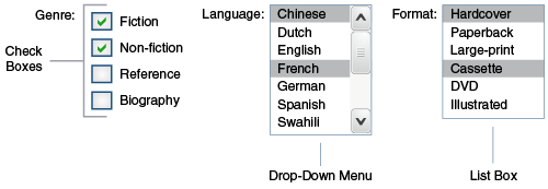
Displaying Components for Selecting Multiple Values
In some cases, you need to allow your users to select multiple values rather than just one value from a list of choices. You can do this using one of the following component tags:
-
An
h:selectManyCheckboxtag, displayed as a set of check boxes -
An
h:selectManyMenutag, displayed as a menu -
An
h:selectManyListboxtag, displayed as a box
Figure 10-4 shows examples of these components.
Figure 10-4 Example Components for Selecting Multiple Values
These tags allow the user to select zero or more values from a set of
values. This section explains the h:selectManyCheckbox tag. The
h:selectManyListbox and h:selectManyMenu tags are used in a similar
way.
Unlike a menu, a list displays a subset of items in a box; a menu
displays only one item at a time when the user is not selecting the
menu. The size attribute of the h:selectManyListbox tag determines
the number of items displayed at one time. The box includes a scroll bar
for scrolling through any remaining items in the list.
The h:selectManyCheckbox tag renders a group of check boxes, with each
check box representing one value that can be selected:
<h:selectManyCheckbox id="newslettercheckbox"
                      layout="pageDirection"
                      value="#{cashierBean.newsletters}">
    <f:selectItems value="#{cashierBean.newsletterItems}"/>
</h:selectManyCheckbox>
The value attribute of the h:selectManyCheckbox tag identifies the
newsletters property of the CashierBean managed bean. This property
holds the values of the currently selected items from the set of check
boxes. You are not required to provide a value for the currently
selected items. If you don’t provide a value, the first item in the list
is selected by default. In the CashierBean managed bean, this value is
instantiated to 0, so no items are selected by default.
The layout attribute indicates how the set of check boxes is arranged
on the page. Because layout is set to pageDirection, the check boxes
are arranged vertically. The default is lineDirection, which aligns
the check boxes horizontally.
The h:selectManyCheckbox tag must also contain a tag or set of tags
representing the set of check boxes. To represent a set of items, you
use the f:selectItems tag. To represent each item individually, you
use the f:selectItem tag. The following section explains these tags in
more detail.
Using the f:selectItem and f:selectItems Tags
The f:selectItem and f:selectItems tags represent components that
can be nested inside a component that allows you to select one or
multiple items. An f:selectItem tag contains the value, label, and
description of a single item. An f:selectItems tag contains the
values, labels, and descriptions of the entire list of items.
You can use either a set of f:selectItem tags or a single
f:selectItems tag within your component tag.
The advantages of using the f:selectItems tag are as follows.
-
Items can be represented by using different data structures, including
Array,Map, andCollection. The value of thef:selectItemstag can represent even a generic collection of POJOs. -
Different lists can be concatenated into a single component, and the lists can be grouped within the component.
-
Values can be generated dynamically at runtime.
The advantages of using f:selectItem are as follows.
-
Items in the list can be defined from the page.
-
Less code is needed in the backing bean for the
f:selectItemproperties.
The rest of this section shows you how to use the f:selectItems and
f:selectItem tags.
Using the f:selectItems Tag
The following example from Displaying Components for
Selecting Multiple Values shows how to use the h:selectManyCheckbox
tag:
<h:selectManyCheckbox id="newslettercheckbox"
                      layout="pageDirection"
                      value="#{cashierBean.newsletters}">
    <f:selectItems value="#{cashierBean.newsletterItems}"/>
</h:selectManyCheckbox>
The value attribute of the f:selectItems tag is bound to the managed
bean property cashierBean.newsletterItems. The individual SelectItem
objects are created programmatically in the managed bean.
See UISelectItems Properties for information on how to write a managed bean property for one of these tags.
Using the f:selectItem Tag
The f:selectItem tag represents a single item in a list of items. Here
is the example from Displaying a Menu Using the
h:selectOneMenu Tag once again:
<h:selectOneMenu id="shippingOption"
                 required="true"
                 value="#{cashierBean.shippingOption}">
    <f:selectItem itemValue="2"
                  itemLabel="#{bundle.QuickShip}"/>
    <f:selectItem itemValue="5"
                  itemLabel="#{bundle.NormalShip}"/>
    <f:selectItem itemValue="7"
                  itemLabel="#{bundle.SaverShip}"/>
 </h:selectOneMenu>
The itemValue attribute represents the value for the f:selectItem
tag. The itemLabel attribute represents the String that appears in
the list component on the page.
The itemValue and itemLabel attributes are value-binding enabled,
meaning that they can use value-binding expressions to refer to values
in external objects. These attributes can also define literal values, as
shown in the example h:selectOneMenu tag.
Displaying the Results from Selection Components
If you display components that allow a user to select values, you may also want to display the result of the selection.
For example, you might want to thank a user who selected the checkbox to
join the Duke Fan Club, as described in Displaying a Check
Box Using the h:selectBooleanCheckbox Tag. Because the checkbox is
bound to the specialOffer property of CashierBean, a
UISelectBoolean value, you can call the isSelected method of the
property to determine whether to render a thank-you message:
<h:outputText value="#{bundle.DukeFanClubThanks}"
              rendered="#{cashierBean.specialOffer.isSelected()}"/>
Similarly, you might want to acknowledge that a user subscribed to
newsletters using the h:selectManyCheckbox tag, as described in
Displaying Components for Selecting Multiple Values. To do
so, you can retrieve the value of the newsletters property, the
String array that holds the selected items:
<h:outputText value="#{bundle.NewsletterThanks}"
              rendered="#{!empty cashierBean.newsletters}"/>
<ul>
    <ui:repeat value="#{cashierBean.newsletters}" var="nli">
        <li><h:outputText value="#{nli}" /></li>
    </ui:repeat>
</ul>
An introductory thank-you message is displayed only if the newsletters
array is not empty. Then a ui:repeat tag, a simple way to show values
in a loop, displays the contents of the selected items in an itemized
list. (This tag is listed in Table 8-2.)
Using Data-Bound Table Components
Data-bound table components display relational data in a tabular format.
In a JavaServer Faces application, the h:dataTable component tag
supports binding to a collection of data objects and displays the data
as an HTML table. The h:column tag represents a column of data within
the table, iterating over each record in the data source, which is
displayed as a row. Here is an example:
<h:dataTable id="items"
             captionClass="list-caption
             columnClasses="list-column-center, list-column-left,
             list-column-right, list-column-center"
             footerClass="list-footer"
             headerClass="list-header"
             rowClasses="list-row-even, list-row-odd"
             styleClass="list-background"
             summary="#{bundle.ShoppingCart}"
             value="#{cart.items}"
             border="1"
             var="item">
    <h:column>
        <f:facet name="header">
            <h:outputText value="#{bundle.ItemQuantity}" />
        </f:facet>
        <h:inputText id="quantity"
                     size="4"
                     value="#{item.quantity}"
                     title="#{bundle.ItemQuantity}">
            <f:validateLongRange minimum="1"/>
            <f:valueChangeListener
                type="javaeetutorial.dukesbookstore.listeners.QuantityChanged"/>
        </h:inputText>
    </h:column>
    <h:column>
        <f:facet name="header">
            <h:outputText value="#{bundle.ItemTitle}"/>
        </f:facet>
        <h:commandLink action="#{showcart.details}">
            <h:outputText value="#{item.item.title}"/>
        </h:commandLink>
    </h:column>
    ...
    <f:facet name="footer"
        <h:panelGroup>
            <h:outputText value="#{bundle.Subtotal}"/>
            <h:outputText value="#{cart.total}" />
                <f:convertNumber currencySymbol="$" type="currency" />
            </h:outputText>
        </h:panelGroup>
    </f:facet>
    <f:facet name="caption">
        <h:outputText value="#{bundle.Caption}"/>
    </f:facet>
</h:dataTable>
The example h:dataTable tag displays the books in the shopping cart as
well as the quantity of each book in the shopping cart, the prices, and
a set of buttons the user can click to remove books from the shopping
cart.
The h:column tags represent columns of data in a data component. While
the data component is iterating over the rows of data, it processes the
column component associated with each h:column tag for each row in the
table.
The h:dataTable tag shown in the preceding code example iterates
through the list of books (cart.items) in the shopping cart and
displays their titles, authors, and prices. Each time the h:dataTable
tag iterates through the list of books, it renders one cell in each
column.
The h:dataTable and h:column tags use facets to represent parts of
the table that are not repeated or updated. These parts include headers,
footers, and captions.
In the preceding example, h:column tags include f:facet tags for
representing column headers or footers. The h:column tag allows you to
control the styles of these headers and footers by supporting the
headerClass and footerClass attributes. These attributes accept
space-separated lists of CSS classes, which will be applied to the
header and footer cells of the corresponding column in the rendered
table.
Facets can have only one child, so an h:panelGroup tag is needed if
you want to group more than one component within an f:facet. Because
the facet tag representing the footer includes more than one tag, the
h:panelGroup tag is needed to group those tags. Finally, this
h:dataTable tag includes an f:facet tag with its name attribute
set to caption, causing a table caption to be rendered above the
table.
This table is a classic use case for a data component because the number of books might not be known to the application developer or the page author when that application is developed. The data component can dynamically adjust the number of rows of the table to accommodate the underlying data.
The value attribute of an h:dataTable tag references the data to be
included in the table. This data can take the form of any of the
following:
-
A list of beans
-
An array of beans
-
A single bean
-
A
javax.faces.model.DataModelobject -
A
java.sql.ResultSetobject -
A
javax.servlet.jsp.jstl.sql.Resultobject -
A
javax.sql.RowSetobject
All data sources for data components have a DataModel wrapper. Unless
you explicitly construct a DataModel wrapper, the JavaServer Faces
implementation will create one around data of any of the other
acceptable types. See Writing Bean
Properties for more information on how to write properties for use with
a data component.
The var attribute specifies a name that is used by the components
within the h:dataTable tag as an alias to the data referenced in the
value attribute of h:dataTable.
In the example h:dataTable tag, the value attribute points to a list
of books. The var attribute points to a single book in that list. As
the h:dataTable tag iterates through the list, each reference to
item points to the current book in the list.
The h:dataTable tag also has the ability to display only a subset of
the underlying data. This feature is not shown in the preceding example.
To display a subset of the data, you use the optional first and rows
attributes.
The first attribute specifies the first row to be displayed. The
rows attribute specifies the number of rows, starting with the first
row, to be displayed. For example, if you wanted to display records 2
through 10 of the underlying data, you would set first to 2 and rows
to 9. When you display a subset of the data in your pages, you might
want to consider including a link or button that causes subsequent rows
to display when clicked. By default, both first and rows are set to
zero, and this causes all the rows of the underlying data to display.
Table 10-7 shows the optional attributes for the
h:dataTable tag.
Table 10-7 Optional Attributes for the h:dataTable Tag
Attribute |
Defines Styles For |
|
Table caption |
|
All the columns |
|
Footer |
|
Header |
|
Rows |
|
The entire table |
Each of the attributes in Table 10-7 can specify more than
one style. If columnClasses or rowClasses specifies more than one
style, the styles are applied to the columns or rows in the order that
the styles are listed in the attribute. For example, if columnClasses
specifies styles list-column-center and list-column-right, and if
the table has two columns, the first column will have style
list-column-center, and the second column will have style
list-column-right.
If the style attribute specifies more styles than there are columns or rows, the remaining styles will be assigned to columns or rows starting from the first column or row. Similarly, if the style attribute specifies fewer styles than there are columns or rows, the remaining columns or rows will be assigned styles starting from the first style.
Displaying Error Messages with the h:message and h:messages Tags
The h:message and h:messages tags are used to display error messages
when conversion or validation fails. The h:message tag displays error
messages related to a specific input component, whereas the h:messages
tag displays the error messages for the entire page.
Here is an example h:message tag from the guessnumber-jsf
application:
<p>
    <h:inputText id="userNo"
                 title="Type a number from 0 to 10:"
                 value="#{userNumberBean.userNumber}">
        <f:validateLongRange minimum="#{userNumberBean.minimum}"
                             maximum="#{userNumberBean.maximum}"/>
   </h:inputText>
   <h:commandButton id="submit" value="Submit"
                    action="response"/>
</p>
<h:message showSummary="true" showDetail="false"
           style="color: #d20005;
           font-family: 'New Century Schoolbook', serif;
           font-style: oblique;
           text-decoration: overline"
           id="errors1"
           for="userNo"/>
The for attribute refers to the ID of the component that generated the
error message. The error message is displayed at the same location that
the h:message tag appears in the page. In this case, the error message
will appear below the Submit button.
The style attribute allows you to specify the style of the text of the
message. In the example in this section, the text will be a shade of
red, New Century Schoolbook, serif font family, and oblique style, and a
line will appear over the text. The message and messages tags support
many other attributes for defining styles. For more information on these
attributes, refer to the oJavaServer Faces Facelets Tag
Library documentation.
Another attribute supported by the h:messages tag is the layout
attribute. Its default value is list, which indicates that the
messages are displayed in a bullet list using the HTML ul and li
elements. If you set the attribute value to table, the messages will
be rendered in a table using the HTML table element.
The preceding example shows a standard validator that is registered on
the input component. The message tag displays the error message that is
associated with this validator when the validator cannot validate the
input component’s value. In general, when you register a converter or
validator on a component, you are queueing the error messages associated
with the converter or validator on the component. The h:message and
h:messages tags display the appropriate error messages that are queued
on the component when the validators or converters registered on that
component fail to convert or validate the component’s value.
Standard error messages are provided with standard converters and standard validators. An application architect can override these standard messages and supply error messages for custom converters and validators by registering custom error messages with the application.
Creating Bookmarkable URLs with the h:button and h:link Tags
The ability to create bookmarkable URLs refers to the ability to generate links based on a specified navigation outcome and on component parameters.
In HTTP, most browsers by default send GET requests for URL retrieval
and POST requests for data processing. The GET requests can have query
parameters and can be cached, which is not advised for POST requests,
which send data to servers for processing. The other JavaServer Faces
tags capable of generating links use either simple GET requests, as in
the case of h:outputLink, or POST requests, as in the case of
h:commandLink or h:commandButton tags. GET requests with query
parameters provide finer granularity to URL strings. These URLs are
created with one or more name=value parameters appended to the simple
URL after a ? character and separated by either &; or &
strings.
To create a bookmarkable URL, use an h:link or h:button tag. Both of
these tags can generate a link based on the outcome attribute of the
component. For example:
<h:link outcome="somepage" value="Message" />The h:link tag will generate a URL link that points to the
somepage.xhtml file on the same server. The following sample HTML is
generated from the preceding tag, assuming that the application name is
simplebookmark:
<a href="/simplebookmark/somepage.xhtml>Message</a>This is a simple GET request that cannot pass any data from page to
page. To create more complex GET requests and utilize the complete
functionality of the h:link tag, use view parameters.
Using View Parameters to Configure Bookmarkable URLs
To pass a parameter from one page to another, use the
includeViewParams attribute in your h:link tag and, in addition, use
an f:param tag to specify the name and value to be passed. Here the
h:link tag specifies the outcome page as personal.xhtml and provides
a parameter named Result whose value is a managed bean property:
<h:body>
    <h:form>
        <h:graphicImage url="#{resource['images:duke.waving.gif']}"
                        alt="Duke waving his hand"/>
        <h2>Hello, #{hello.name}!</h2>
        <p>I've made your
            <h:link outcome="personal" value="personal greeting page!"
                    includeViewParams="true">
                <f:param name="Result" value="#{hello.name}"/>
            </h:link>
        </p>
        <h:commandButton id="back" value="Back" action="index" />
    </h:form>
</h:body>
If the includeViewParams attribute is set on the component, the view
parameters are added to the hyperlink. Therefore, the resulting URL will
look something like this if the value of hello.name is Timmy:
http://localhost:8080/bookmarks/personal.xhtml?Result=TimmyOn the outcome page, specify the core tags f:metadata and
f:viewparam as the source of parameters for configuring the URLs. View
parameters are declared as part of f:metadata for a page, as shown in
the following example:
<f:metadata>
    <f:viewParam name="Result" value="#{hello.name}"/>
</f:metadata>
This allows you to specify the bean property value on the page:
<h:outputText value="Howdy, #{hello.name}!" />As a view parameter, the name also appears in the page’s URL. If you edit the URL, you change the output on the page.
Because the URL can be the result of various parameter values, the order of the URL creation has been predefined. The order in which the various parameter values are read is as follows:
-
Component
-
Navigation-case parameters
-
View parameters
The bookmarks Example Application
The bookmarks example application modifies the hello1 application
described in A Web Module That Uses JavaServer
Faces Technology: The hello1 Example to use a bookmarkable URL that
uses view parameters.
Like hello1, the application includes the Hello.java managed bean,
an index.xhtml page, and a response.xhtml page. In addition, it
includes a personal.xhtml page, to which a bookmarkable URL and view
parameters are passed from the response.xhtml page, as described in
Using View Parameters to Configure Bookmarkable URLs.
You can use either NetBeans IDE or Maven to build, package, deploy, and
run the bookmarks example. The source code for this example is in the
tut-install`/examples/web/jsf/bookmarks/` directory.
The following topics are addressed here:
To Build, Package, and Deploy the bookmarks Example Using NetBeans IDE
-
Make sure that GlassFish Server has been started (see Starting and Stopping GlassFish Server).
-
From the File menu, choose Open Project.
-
In the Open Project dialog box, navigate to:
tut-install/examples/web/jsf -
Select the
bookmarksfolder. -
Click Open Project.
-
In the Projects tab, right-click the
bookmarksproject and select Build.This option builds the example application and deploys it to your GlassFish Server instance.
To Build, Package, and Deploy the bookmarks Example Using Maven
-
Make sure that GlassFish Server has been started (see Starting and Stopping GlassFish Server).
-
In a terminal window, go to:
tut-install/examples/web/jsf/bookmarks/ -
Enter the following command:
mvn installThis command builds and packages the application into a WAR file,
bookmarks.war, that is located in thetargetdirectory. It then deploys the WAR file to your GlassFish Server instance.
To Run the bookmarks Example
-
Enter the following URL in your web browser:
http://localhost:8080/bookmarks -
In the text field, enter a name and click Submit.
-
On the response page, move your mouse over the "personal greeting page" link to view the URL with the view parameter, then click the link.
The
personal.xhtmlpage opens, displaying a greeting to the name you typed. -
In the URL field, modify the Result parameter value and press Return.
The name in the greeting changes to what you typed.
Resource Relocation Using h:outputScript and h:outputStylesheet Tags
Resource relocation refers to the ability of a JavaServer Faces application to specify the location where a resource can be rendered. Resource relocation can be defined with the following HTML tags:
-
h:outputScript -
h:outputStylesheet
These tags have name and target attributes, which can be used to
define the render location. For a complete list of attributes for these
tags, see theoJavaServer Faces Facelets Tag Library
documentation.
For the h:outputScript tag, the name and target attributes define
where the output of a resource may appear. Here is an example:
<html xmlns="http://www.w3.org/1999/xhtml"
      xmlns:h="http://xmlns.jcp.org/jsf/html">
    <h:head id="head">
        <title>Resource Relocation</title>
    </h:head>
    <h:body id="body">
        <h:form id="form">
            <h:outputScript name="hello.js"/>
            <h:outputStylesheet name="hello.css"/>
        </h:form>
    </h:body>
</html>
Because the target attribute is not defined in the tags, the style
sheet hello.css is rendered in the head element of the page, and the
hello.js script is rendered in the body of the page.
Here is the HTML generated by the preceding code:
<html xmlns="http://www.w3.org/1999/xhtml">
    <head>
        <title>Resource Relocation</title>
        <link type="text/css" rel="stylesheet"
              href="/context-root/javax.faces.resource/hello.css"/>
    </head>
    <body>
        <form id="form" name="form" method="post"
              action="..." enctype="...">
            <script type="text/javascript"
                    src="/context-root/javax.faces.resource/hello.js">
            </script>
        </form>
    </body>
</html>
If you set the target attribute for the h:outputScript tag, the
incoming GET request provides the location parameter. Here is an
example:
<html xmlns="http://www.w3.org/1999/xhtml"
      xmlns:h="http://xmlns.jcp.org/jsf/html">
    <h:head id="head">
        <title>Resource Relocation</title>
    </h:head>
    <h:body id="body">
        <h:form id="form">
            <h:outputScript name="hello.js" target="#{param.location}"/>
            <h:outputStylesheet name="hello.css"/>
        </h:form>
    </h:body>
</html>
In this case, if the incoming request does not provide a location
parameter, the default locations will still apply: The style sheet is
rendered in the head, and the script is rendered inline. However, if the
incoming request specifies the location parameter as the head, both the
style sheet and the script will be rendered in the head element.
The HTML generated by the preceding code is as follows:
<html xmlns="http://www.w3.org/1999/xhtml">
    <head>
        <title>Resource Relocation</title>
        <link type="text/css" rel="stylesheet"
              href="/context-root/javax.faces.resource/hello.css"/>
        <script type="text/javascript"
                src="/context-root/javax.faces.resource/hello.js">
          </script>
    </head>
    <body>
        <form id="form" name="form" method="post"
              action="..." enctype="...">
        </form>
    </body>
</html>
Similarly, if the incoming request provides the location parameter as the body, the script will be rendered in the body element.
The preceding section describes simple uses for resource relocation. That feature can add even more functionality for the components and pages. A page author does not have to know the location of a resource or its placement.
By using a @ResourceDependency annotation for the components,
component authors can define the resources for the component, such as a
style sheet and script. This allows the page authors freedom from
defining resource locations.